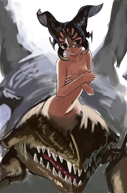
The next class we had the "lineart" due for the poster. I admittedly hadn't touched it until the day of, so I threw together some more designs and made it a sort of "collage poster"(which is what I had originally pitched, a la video game covers).
But again, after seeing everyone else's dynamic posters, I did not like mine at all. Even with everything going on there, I knew it would come down to me making excuses in the end. Everyone had dynamic scenes of action and I just had some characters standing there, most not even the full body. I also noted that everyone seemed to be doing something that really represented themselves-- though I'm a person who loves drawing girls (and I've been accused of ONLY drawing girls, haha...) I did not feel like I was giving this my all. As the professor said in class, "I never get anyone's best work. I get like... their second best." I didn't want that to be me. Though I find it absolutely impossible for me to deliver my "best" work in class (and I don't know why either, am I just that restricted by school?), I thought that if I did this as close to my free doodles that it would turn out infinitely better.
So, this is the pen drawing I did:
So already I have a more dynamic pose. This is thanks to the in-class exercise we did. I had already done this in Cartooning, but it really stuck with me now that I did it a second time (or third... or fourth... we do this in every sequential class actually, don't we?). Essentially, start with a strong curved line, and use that to define the line of action. We looked over Eric Canete's and Bruce Timm's work to really show where we were trying to push our drawings, along with other artists and popular cartoons. Again, done this before, but it really stuck this time. I definitely don't want to be the stale artist a lot of people around my level are. For what I lack in technical skill, I want to make up for with just raw appealing action. So this drawing will hopefully be the first of many that begin my evolution into a stronger, more confident artist.
As for the final image, I incorporated painting techniques I've seen used by Greg Staple and Todd Lockwood, along with design qualities of Hyung Tae-Kim and various manga artists. Even though painting dragons is something completely new to me (taught myself this past summer with the Charizard drawing), I've found it to be even therapeutic and a very good exercise in rendering, both adding detail and seeing what we could get away with leaving out.


