Monday, November 14, 2011
Thursday, October 27, 2011
Roller Derby Poster
Character Design class yesterday, we had this poster due. I just did some mock-up character design for class, and after seeing everyone else's, I thought I should definitely push it more. Here's the original:
The next class we had the "lineart" due for the poster. I admittedly hadn't touched it until the day of, so I threw together some more designs and made it a sort of "collage poster"(which is what I had originally pitched, a la video game covers).
But again, after seeing everyone else's dynamic posters, I did not like mine at all. Even with everything going on there, I knew it would come down to me making excuses in the end. Everyone had dynamic scenes of action and I just had some characters standing there, most not even the full body. I also noted that everyone seemed to be doing something that really represented themselves-- though I'm a person who loves drawing girls (and I've been accused of ONLY drawing girls, haha...) I did not feel like I was giving this my all. As the professor said in class, "I never get anyone's best work. I get like... their second best." I didn't want that to be me. Though I find it absolutely impossible for me to deliver my "best" work in class (and I don't know why either, am I just that restricted by school?), I thought that if I did this as close to my free doodles that it would turn out infinitely better.
So, this is the pen drawing I did:
So already I have a more dynamic pose. This is thanks to the in-class exercise we did. I had already done this in Cartooning, but it really stuck with me now that I did it a second time (or third... or fourth... we do this in every sequential class actually, don't we?). Essentially, start with a strong curved line, and use that to define the line of action. We looked over Eric Canete's and Bruce Timm's work to really show where we were trying to push our drawings, along with other artists and popular cartoons. Again, done this before, but it really stuck this time. I definitely don't want to be the stale artist a lot of people around my level are. For what I lack in technical skill, I want to make up for with just raw appealing action. So this drawing will hopefully be the first of many that begin my evolution into a stronger, more confident artist.
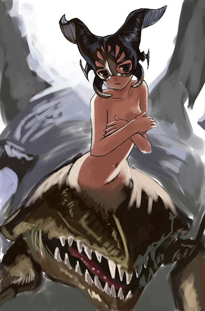
As for the final image, I incorporated painting techniques I've seen used by Greg Staple and Todd Lockwood, along with design qualities of Hyung Tae-Kim and various manga artists. Even though painting dragons is something completely new to me (taught myself this past summer with the Charizard drawing), I've found it to be even therapeutic and a very good exercise in rendering, both adding detail and seeing what we could get away with leaving out.
Tuesday, October 25, 2011
Revival
Oh wow, I've been dead on here for a while. Apologies for that! For some time it would not even let me log in. Well I guess the easiest way to do this would be to just dump all (or most) of the drawings here and some of the videos? Yeah, let's do that. I'll leave this one to be a drawing dump and the subsequent entries shall be a tad more organized. I'll also try to make a habit of getting on daily, or at least every other day.
Friday, July 22, 2011
Big update time!
Sorry for the huge lack of updates, so here's a quick spasm of some stuff I've done! From newest to oldest, these are the drawings I've finished completely. The most recent is a speed-sketch I did while waiting on a response from a commissioner, practicing a different application technique and speed. The second is another relatively quick drawing (but not really, still two hours) I did for a new friend to warm up for my commissions. Third is a drawing of Batman and some characters in "my style," really just a fun wind-down drawing with no real aim, just drawing for the hell of it. After that are two entries for the Lucent Heart drawing contest. I probably won't win, with any luck I can place. I'm not happy with the Theia entry, but people seem to like it more than my Cadena entry. Every video is an actual recording (I figured a way to minimize lag by recording only part of my screen) except the Cadena video, which is a time-lapse.
Wednesday, July 6, 2011
Facebook Portrait Week
I was invited to an event to draw a self-portrait of myself for Facebook, and everyone in the event would use their drawing as their profile picture. I've always used my drawings for profile pictures, but using one of myself is a first. This is also my first self-portrait. The girl is Tori, one of the characters in my comic.
Saturday, July 2, 2011
Y U NO UPDATE?
I haven't updated in a while when I had every intention of doing so. OKAY! So this was the last thing I completed, a painting for MapleStory's Chaos update. I'm currently working on a more realistically rendered fanart piece for Adventure Time. WIPs for that coming up! For this drawing I have a video timelapse.
Tuesday, June 21, 2011
Charizard and a Corvette
Nowhere near Mark Schultz's dinosaurs and Cadillacs, sadly.
So I have new subject matter today. I wanted to do a fantasy painting, and after looking at Todd Lockwood's art, I felt inspiration like never before, like a calling that "I need to do this." His art is possibly the deciding factor for my career path-- I want to paint these kinds of things. Fantasy scenes, beautiful lighting, dragons... oh he is the king of dragons. And of course he loves what he does, and I felt the same way as I painted this.
So the night prior I announced I would paint a fantasy image in the morning. That next morning I woke up at 5 am(much different from the usual 1 pm of summertime) with a splitting headache, one that would not go away even after double-dosing on Advil. But I had a promise to fulfill, I was going to paint something fantastic. And after thinking about it, I realized that if I was going to do something completely new to me, why stick with the same subject matter(generic fantasy paintings are usually scantily-clad women, not much different from my anime work)? So trying something new, I've taken on the challenge of a dragon.
Now I read from an art director that if you have any dragons in your portfolio, unless they're Lockwood-esque dragons you take them out. He was the art director for Dungeons and Dragons, and Todd definitely defined what fantasy dragons should look like. His passion for them really fueled me as I studied piece after piece. The "Daybreaker" piece in his gallery, from Dragon*Con, especially influenced me. He did that painting in about 4 hours! And with that I was set, and entered the realm.
I started with a quick marker sketch in Paint Tool SAI. As I scribbled here and there I thought that this was as good as I needed for an experiment like this.
And shortly after posting I thought, "Well, I have like no Pokémon art and I've loved Pokémon since it first came overseas, and it has been the biggest influence on my life," so to make the concept a little less foreign to me, I decided the rendering should be of Charizard. The last time I drew Charizard, I was about seven I think? I remember it being a marker and sharpie drawing.
Observing Todd Lockwood's work, I saw how gestural it is up-close, like any traditional painting. He does come from a heavy traditional background and treats his digital work as if traditional oils, so I was taking that into account and learning along the way.
At this point I realized I was painting on a single layer(I normally have trigger-finger for Ctrl+Shift+N) and didn't even touch the background(save for color experimenting). In traditional medium it's obvious practice to work background to foreground, so I stopped right there and mixed around the background, keeping it simple-- he's a dragon in flight and he's going to be a pretty rendered dragon to boot, so why make a complicated background at all? A sky will do, and this will be a fun chance to experiment with ways of painting clouds.
Here I brought it into Paint Tool Sai again to use the water tool on the background. There was some obvious stamp-brushing going on that I wasn't too fond of, and the depth was getting a little confusing with random areas of rendered sky right next to huge blocks of blurry color. It's still all on one layer so I had to be a little careful next to places I rendered, but I was going to go over the edges again after I defined the light sources.
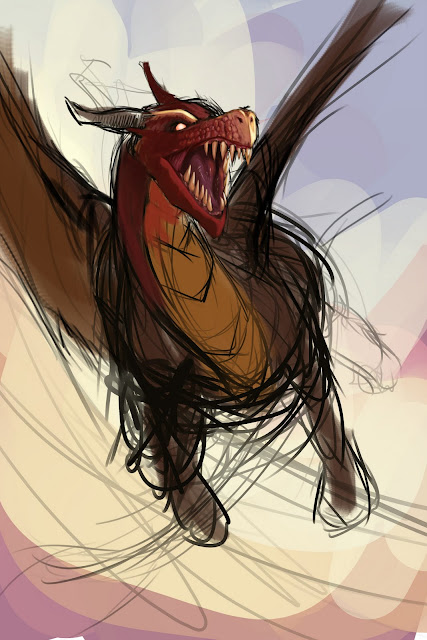
And here's the finished piece! I made new layers for the wings so I could experiment with making more transparent shapes, and then painted cuts and holes in them as the colors of the sky. Charizard's wings are a blue-green(I think? Blue definitely)-ish color which clashes a lot with his red and orange-yellow body, and would look akward. So I worked with layering colors of his body in there one low-fill layers, Multiply layers, et cetera, and put a little blue here-and-there again. Because they're transparent I could let the sky show through for any more blue needed in them, and the colors themselves would match the body more as a light source. As for the fire... I just painted reds and oranges with a textured brush, followed by low-Fill bright yellows and scattered particles. I still don't know how I'm supposed to do this but it was a learning process and maybe I found my own way.
And there you have it. Because I started it in Paint Tool SAI, the drawing is mostly done with the round brush with some settings messed around (you can find all the brushes on Daarken's website, under Tutorials > My Brushes). It's called "My Broosh," and I used it with 17% Flow.
Also, here's a car I drew for my father on Father's Day. It's traditional, as opposed to Charizard. Pencil, ink, white-out. I didn't enjoy drawing it but I felt accomplished as I proved once again I'm not limited to anime girls, haha.
Pokémon is ©Nintendo/Creatures Inc./Game Freak inc. TM.
Tuesday, June 14, 2011
Portrait #2!
I had fun with this one because the paper got all bent up so I treated it like an experiment piece, with white-out and also brushed in ink for strong blacks. I think it turned out better than the last one.
1. Being smarter this time around, doing a light but tight sketch, sighting and measuring ahead of time
to get everything right.
to get everything right.
2. Why break tradition? Eyes first!
3. Like last time, shaded the nose right after the first eye, this time thinking I may have made the eye too small. It looks awful right now.
4. Still ugly! Oh gawd, how could I keep going?!?!
5. Well, with the lips in it looks a little less weird! At this point I took a long break. Really long.
Straight-on view of #5:
6. I began again today, a new day, where I could see how horrible a start I had... ALL OVER AGAIN. Started blocking in values for the hair. I used the side of my pencil to decide where I wanted to ink black in, and then drew in strands.
7. Really rough pencil shading YEAH! Decided to wipe out the arm and just have the shoulder because I'm lazy or something. But you didn't hear me say that (you read it, probably in an obnoxious voice
because I'm lazy).
because I'm lazy).
8. Took a slightly better picture with my iPhone and fixed up the contrast and stuff in Photoshop. Looks kinda like a glamour shot now, huh? Also, added in a signature. Didn't do that last time because I didn't think the signature would photograph well, but then I also forgot that Photoshop has more options than
"Image >Adjustments."
"Image >Adjustments."
Saturday, June 11, 2011
Some doodles and a fun excercise
Hello again! Keeping with the promise from the last entry, there's going to be words in this one! Not too many I'm afraid, but enough to paint the picture, right?
Not quite finished here, but I started drawing and seeing how ink with pencil tones would look for me:

Freebie Sketch #3/6
And here's a progression of a work in progress, something I haven't done in three years... "photorealism!"
1. Sketch basic proportions, and of course start with the eyes.
2. I love drawing eyes!
3. Put a little bit of rendering on the nose to make sure that eye wasn't too big.
4. Hey look! She has two eyes!
5. LIPS.
6. Blocked in the hand, rendered an ear, made basic shapes for the hair. D'oh, I drew the ear too low!
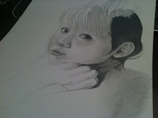
7. Ear in the right place now, I begin to black in the darker parts of the hair. I see a lot of people go awry at this part. It's common to see someone draw every strand of hair and believe that's what makes something "realistic." Rather, draw the hair as simple shapes. This is where you can take a good hint from how anime is drawn, but obviously don't give your person anime hair. Just break it down. Here, since the girl is (obviously) Asian, I'm putting in spot blacks with the side of my pencil, building them up to be strong blacks. I'm not sure if I'll go back with ink later though, but for now I'm treating this as all-pencil.
8. Moar rendering. She's not done yet, but I'm gonna sleep on it because I know I'll start rushing things if I try to finish before hitting the sack.
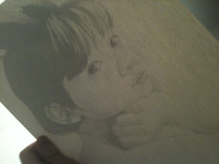
9. And to finish this entry, here's a photo from the back of the drawing held up to light. I've been doing this a lot to check for proportions, make sure everything looks good. I recall my professor, Dove, saying that reversing an image (holding up to a mirror, for example) can help identify problems, like if something is "sliding off" the face. In Paint Tool SAI the shortcut is H, and in Photoshop I like to set the shortcut to Ctrl+H.
Subscribe to:
Comments (Atom)


